|
|
Post by rupert on Dec 12, 2015 16:14:43 GMT
Prince of Persia 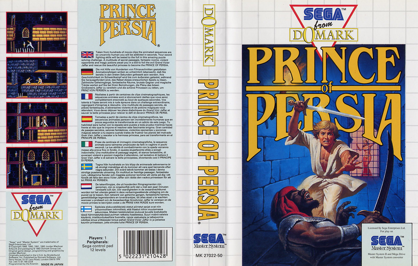 Great Basketball  Wonder Boy III: The Dragon's Trap 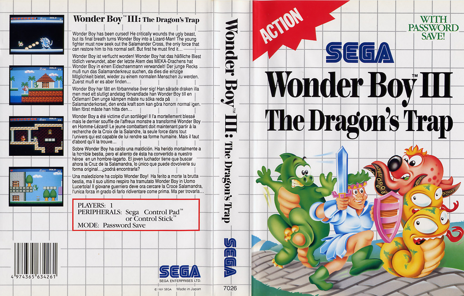 The Smurfs 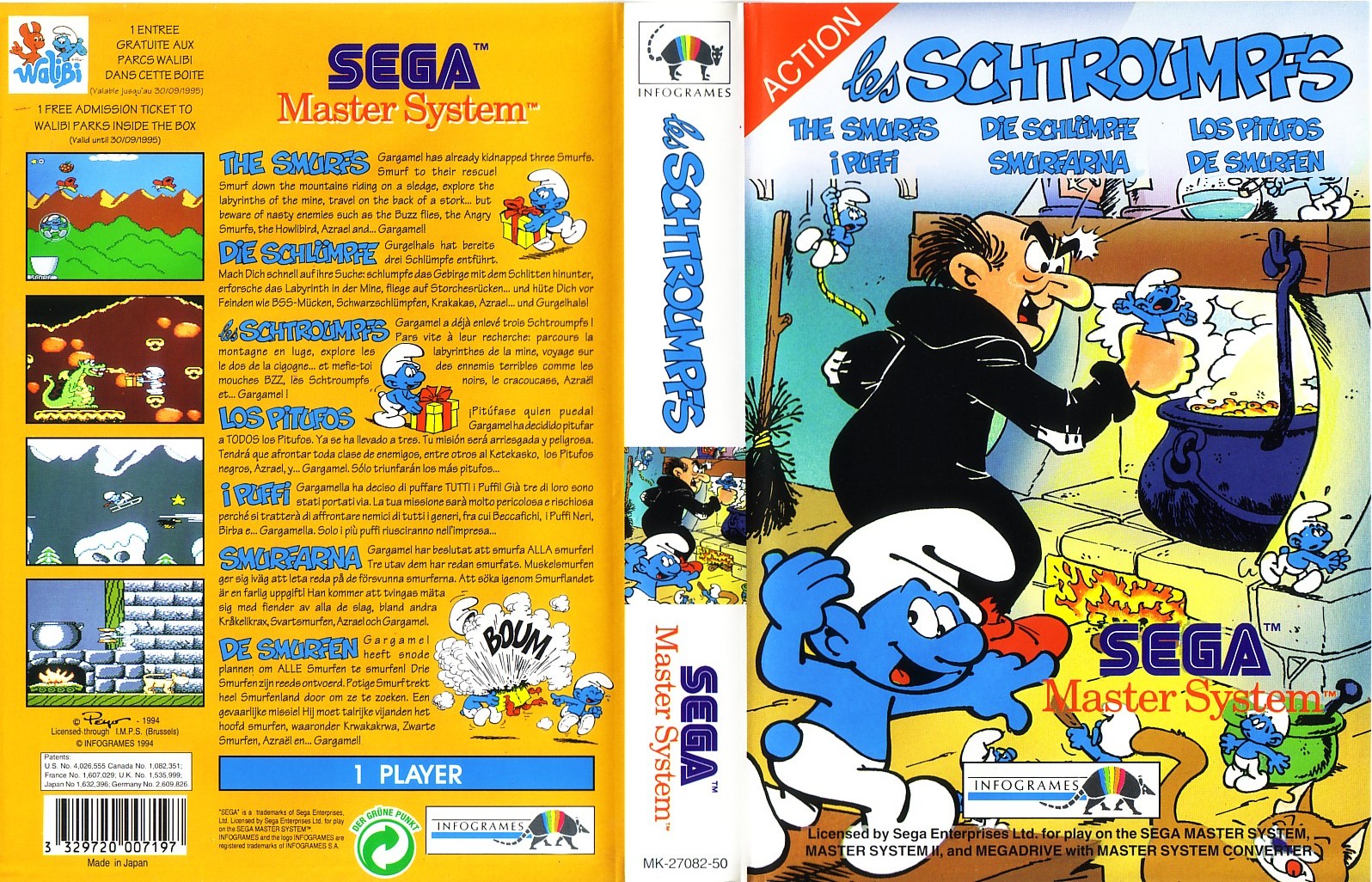 Fire & Ice 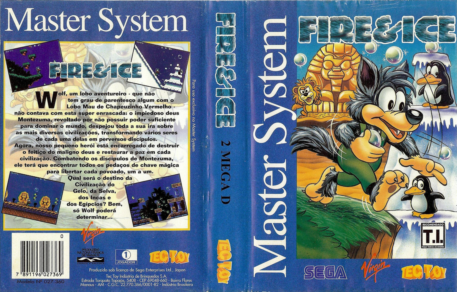 PGA Tour Golf 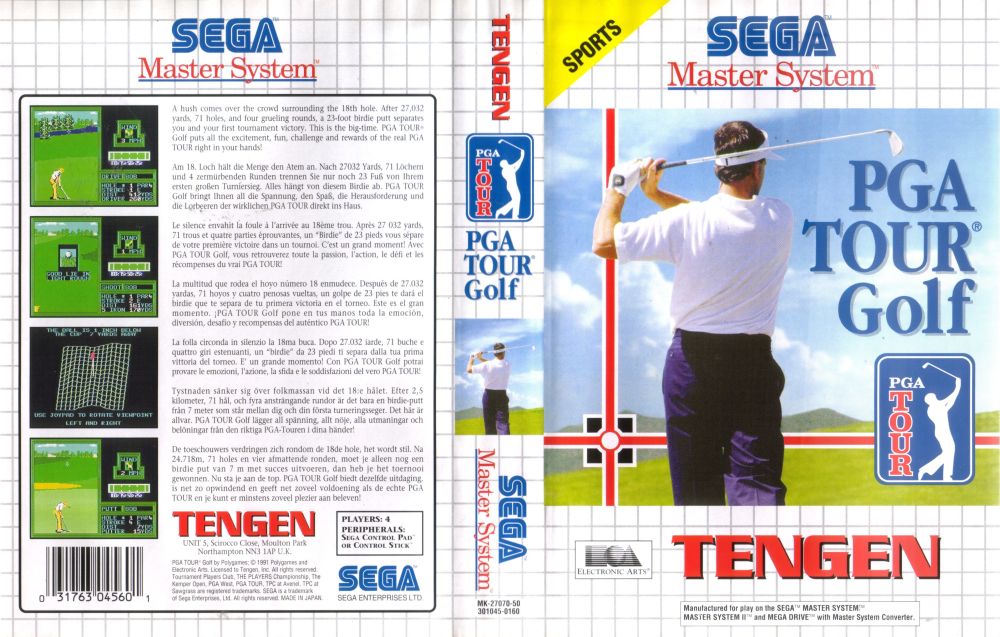 Running Battle 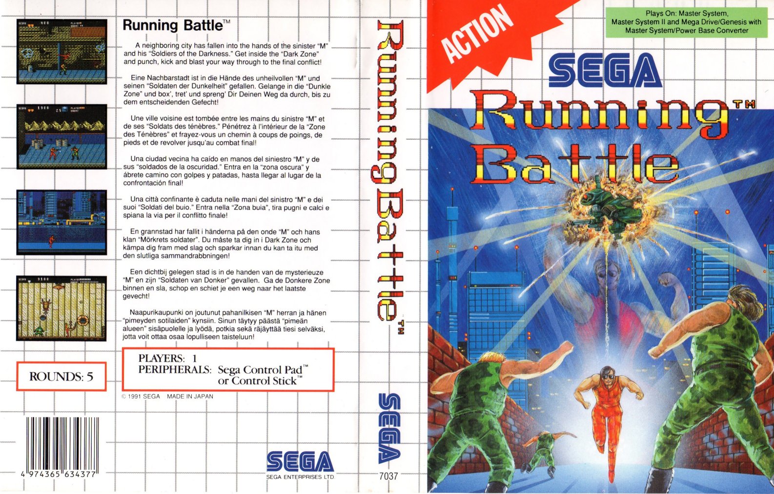 World Grand Prix 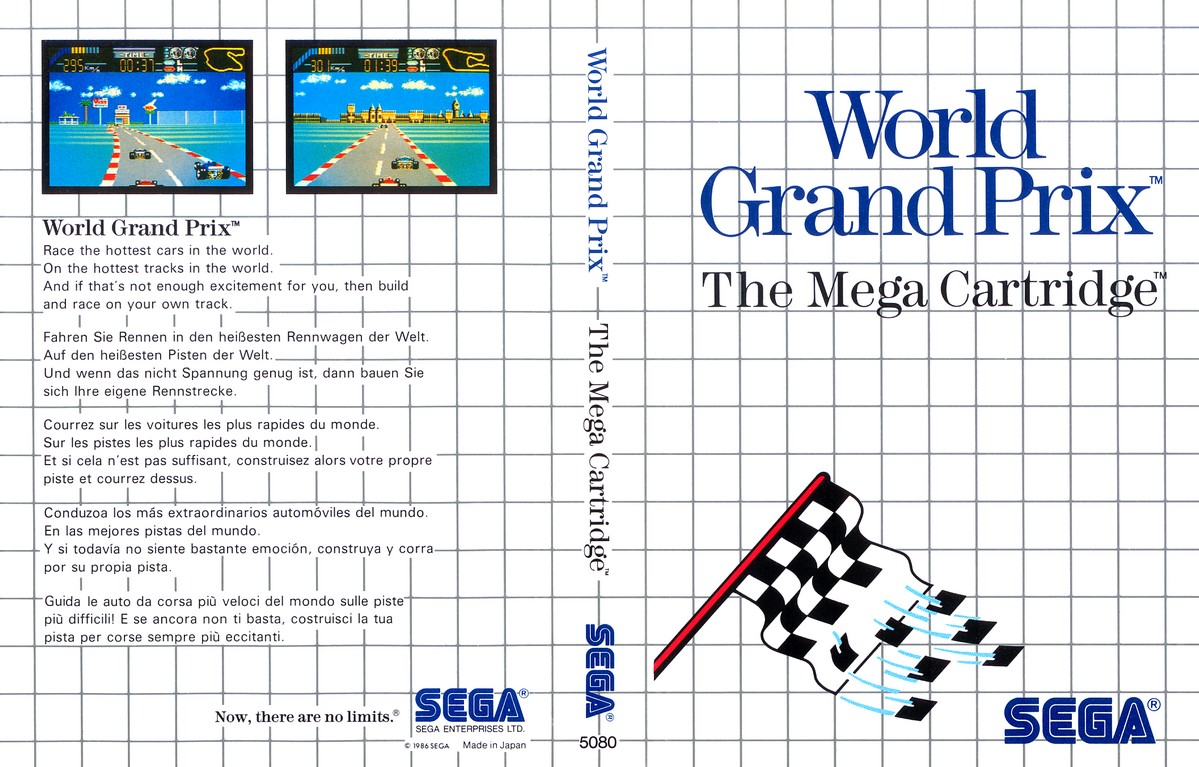 Paperboy US  Joe Montana Football 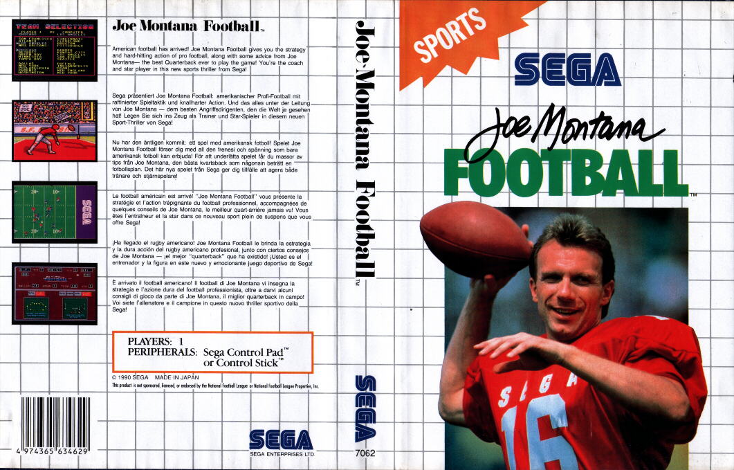 Super Monaco GP II  Star Wars 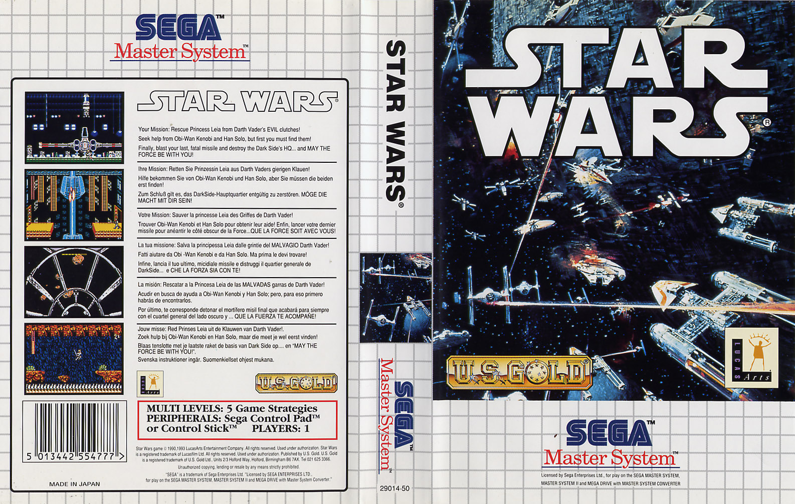 Wanted 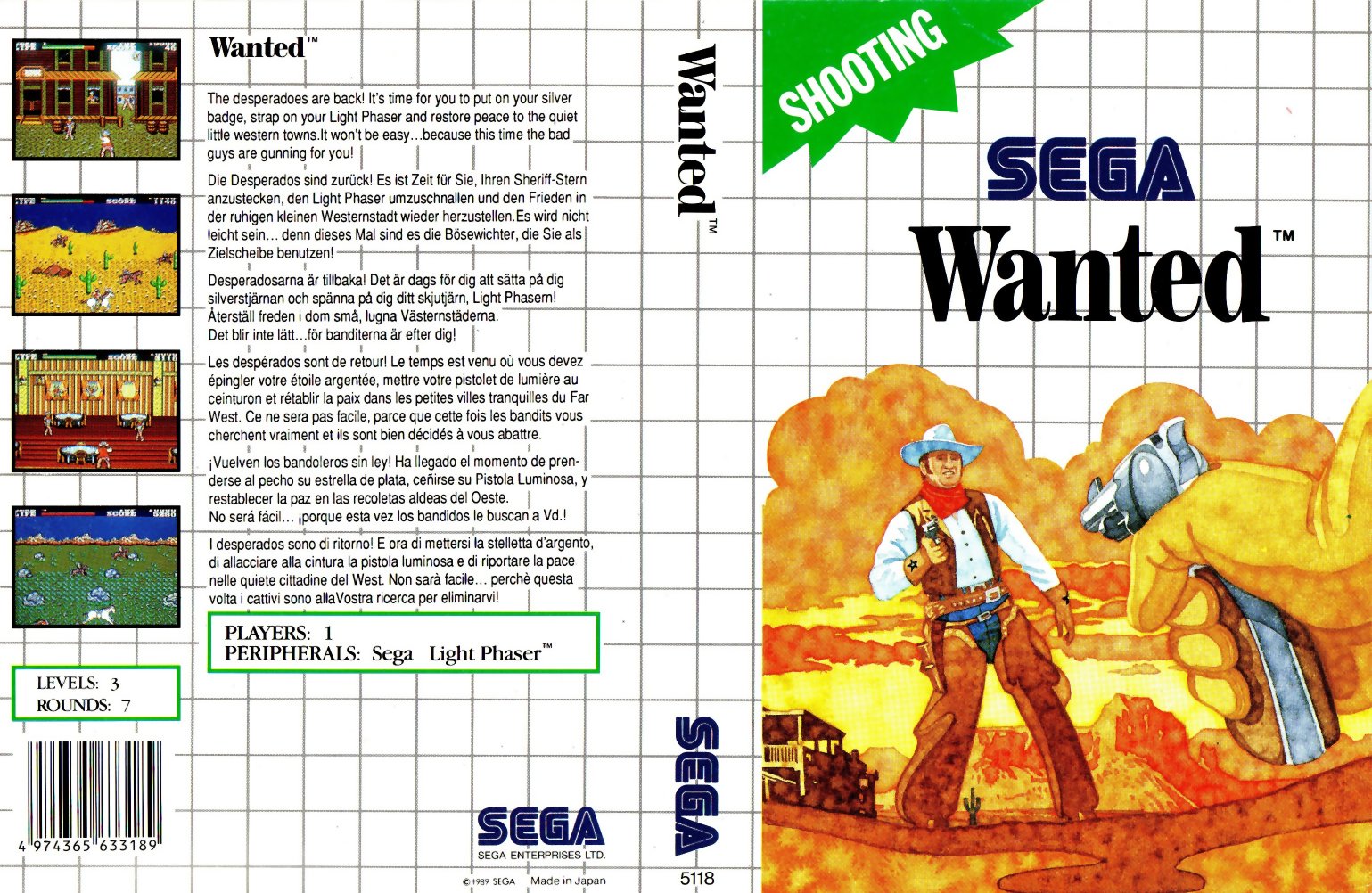 Ghostbusters 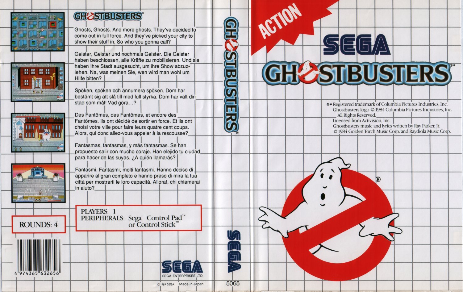 Alf  Zool 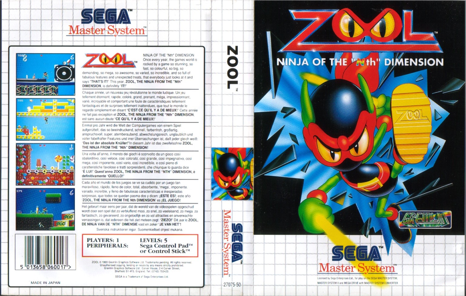 Kings Quest  Road Rash 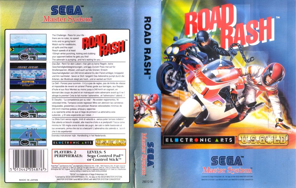 FIFA International Soccer  Ecco - The Tides of Time 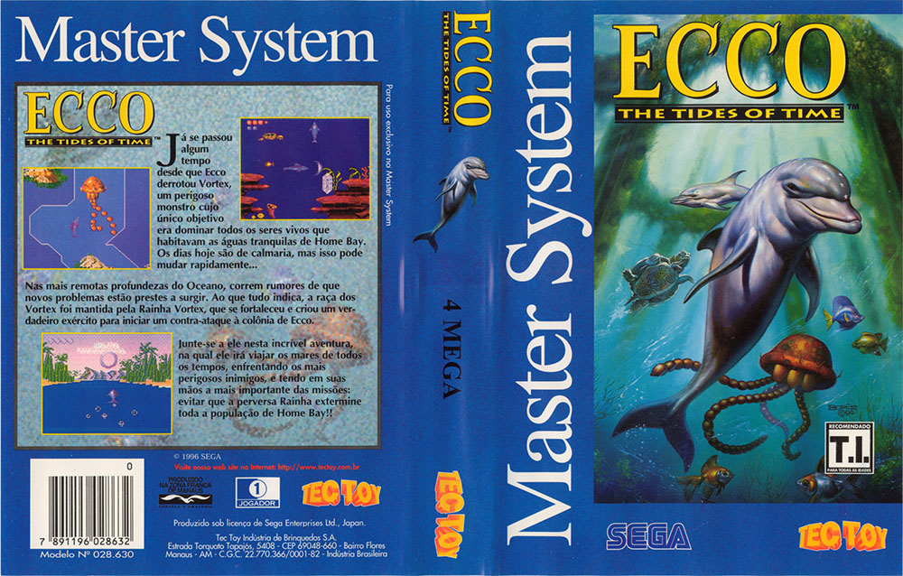 Rastan 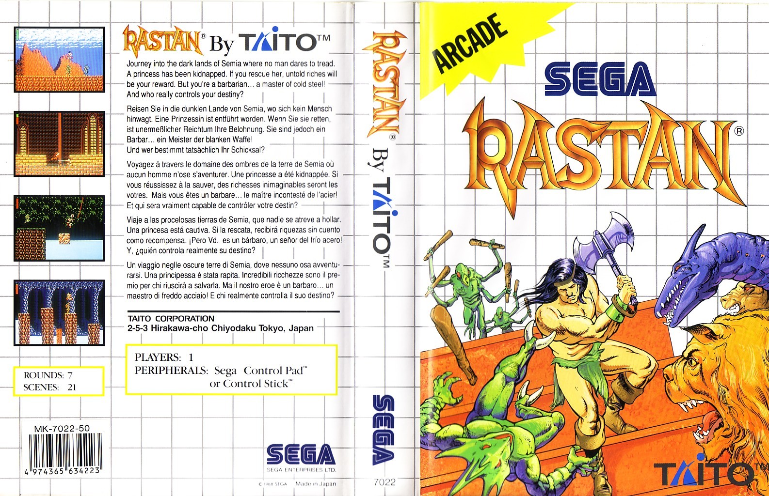 |
|
|
|
Post by wolfticket on Dec 12, 2015 20:13:43 GMT
The Ecco the tides of time cover is the big stand out here for me, probably the best Tectoy cover
|
|
|
|
Post by Transatlantic Foe on Dec 12, 2015 20:42:13 GMT
I think this selection is a bit lacking, there's a lot of multiplatform art and photos. Though the Star Wars one is an awesome piece so I voted for it anyway. World Grand Prix is one of the early minimalist covers that I think works quite well.
But there are some entertaining ones too:
Prince of Persia - Luke Skywalker realises he picked up a sword not a lightsaber, man finds this so hilarious he doubles over in laughter
Wonder Boy 3 - The snakes look particularly worried by the, frankly psychotic, look on that guy's face
Wanted - Derpy cowboy edition
|
|
|
|
Post by Rastanfarian on Dec 13, 2015 1:38:59 GMT
Prince of Persia - Luke Skywalker realises he picked up a sword not a lightsaber, man finds this so hilarious he doubles over in laughter Wonder Boy 3 - The snakes look particularly worried by the, frankly psychotic, look on that guy's face Hilarious!  |
|
|
|
Post by rupert on Dec 13, 2015 22:00:52 GMT
I think this is one of the worst groups. I went with Prince of Persia, Paperboy and Zool.
Running Battle has to be up there in the top 10 worst. Maybe we will see in the worst box art tournament. I don't actually mind most of the minimalist early box art but it just doesnt stand up against some of the good covers.
|
|
|
|
Post by Centrale on Dec 14, 2015 15:44:10 GMT
My selections for this group:
Running Battle - Although the anatomy is questionable, the lighting and the overall composition are really dynamic and exciting... plus I love the audacity of using the title screen logo, painstakingly cut out pixel-by-pixel.
Wanted - a very dramatically framed image, rendered in a beautiful blotted watercolor wash. The color scheme is reminiscent of sepiatone photos, but with more vibrant saturation.
Rastan - I've mentioned before how much I like this (unknown?) artist's SMS covers. The anatomy, perspective and creature design are all solid, but for me it's the very fine color detail that takes it to another level. Worth looking closely at the actual box, as it's a little hard to see from a scan on a computer monitor.
My honorable mentions: Ecco - Boris Vallejo, great as usual. Road Rash - appealing and evocative. Ghostbusters - the logo has timeless appeal, and it works perfectly in the minimalist, iconic style of the early SMS covers. World Grand Prix - a clever icon.
|
|
|
|
Post by Kaunisto on Dec 21, 2015 22:06:02 GMT
Joe Montana: basic sports cover (I may be biased, one his Super Bowls was likely the first game of football I ever saw)
Zool: platformers are about the characters; nothing but Zool in Zool cover
Rastan: interesting angle, feel of action
Almost voted: Wanted
|
|
|
|
Post by playgeneration on Dec 24, 2015 13:58:31 GMT
Star Wars - what an awesome scene, I clearly remember getting this and Star Wars for xmas one year, and loved both.
Rastan - Nicely drawn artwork of some cool looking creatures.
Running Battle - A perfect case of the games artwork matching the actual game content. Its rough looking and feels very amateur, much like the game itself.
|
|
|
|
Post by ShadowAngel on Dec 24, 2015 20:26:54 GMT
Fire & Ice - The Wolf is so cute Star Wars - It's Star Wars, i'm not a big fan of it but it captures Star Wars Road Rash - Nasty Chain to the head! It makes sure to say "This isn't your ordinary driving game!" |
|