|
|
Post by rupert on Dec 13, 2015 0:25:49 GMT
Monopoly 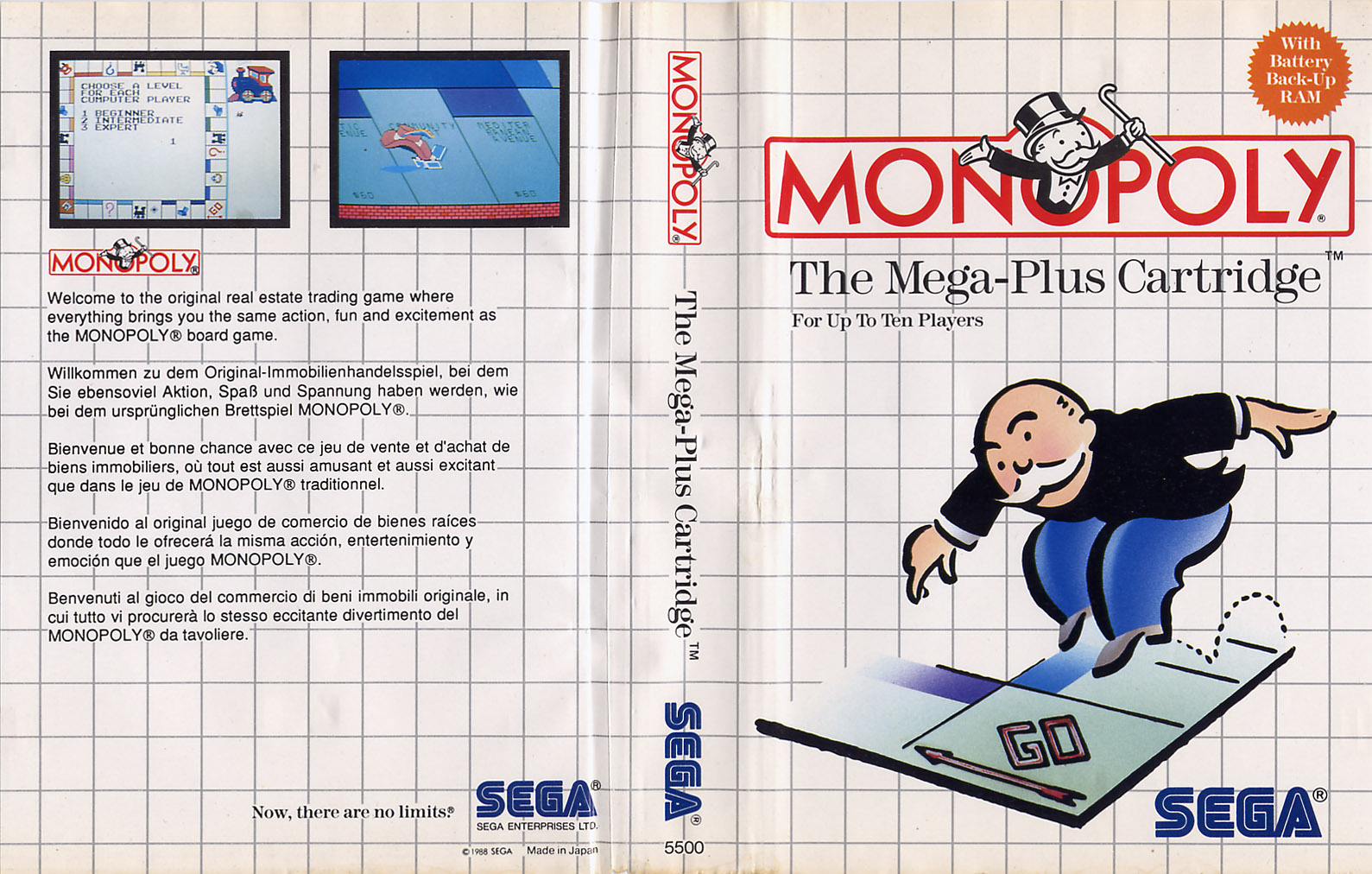 Pro Wrestling 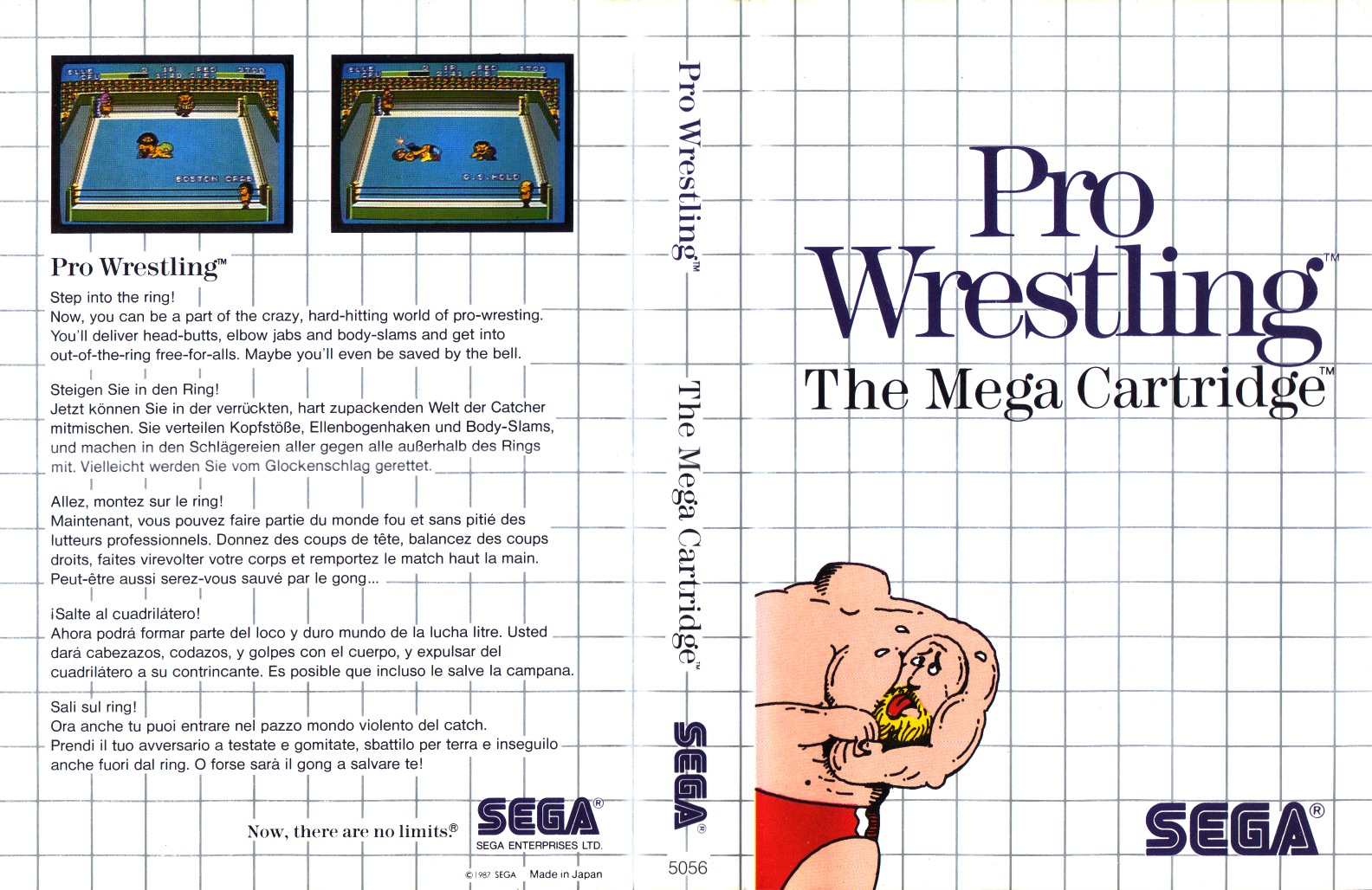 Ferias Frustradas do Pica Pau  Double Hawk 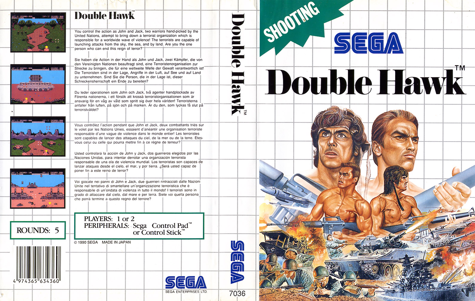 The Incredible Hulk  SpellCaster 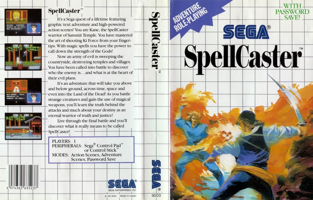 Bank Panic 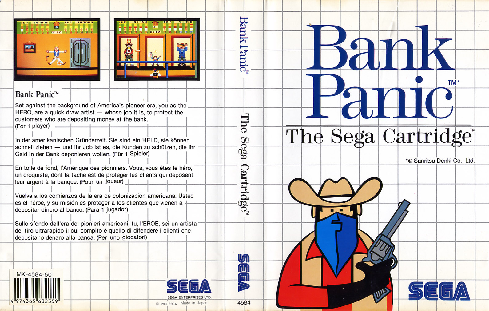 KLAX 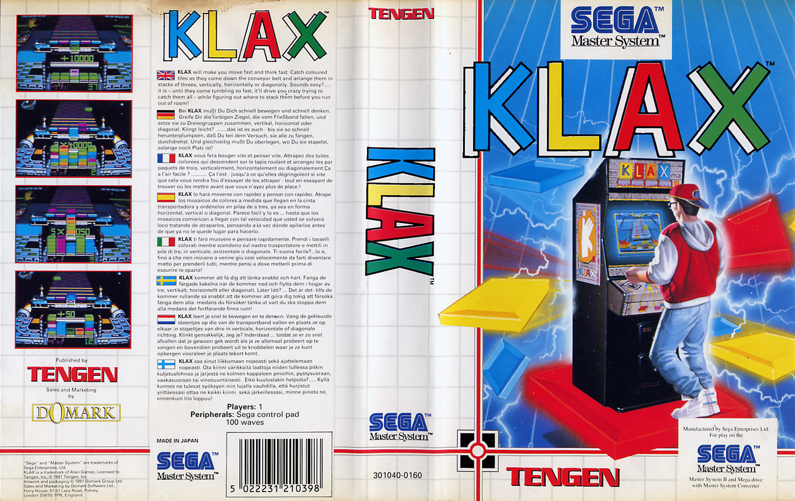 Captain Silver - EU 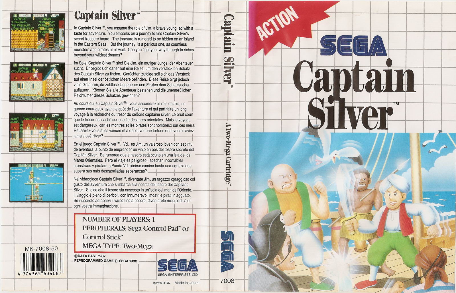 Aladdin 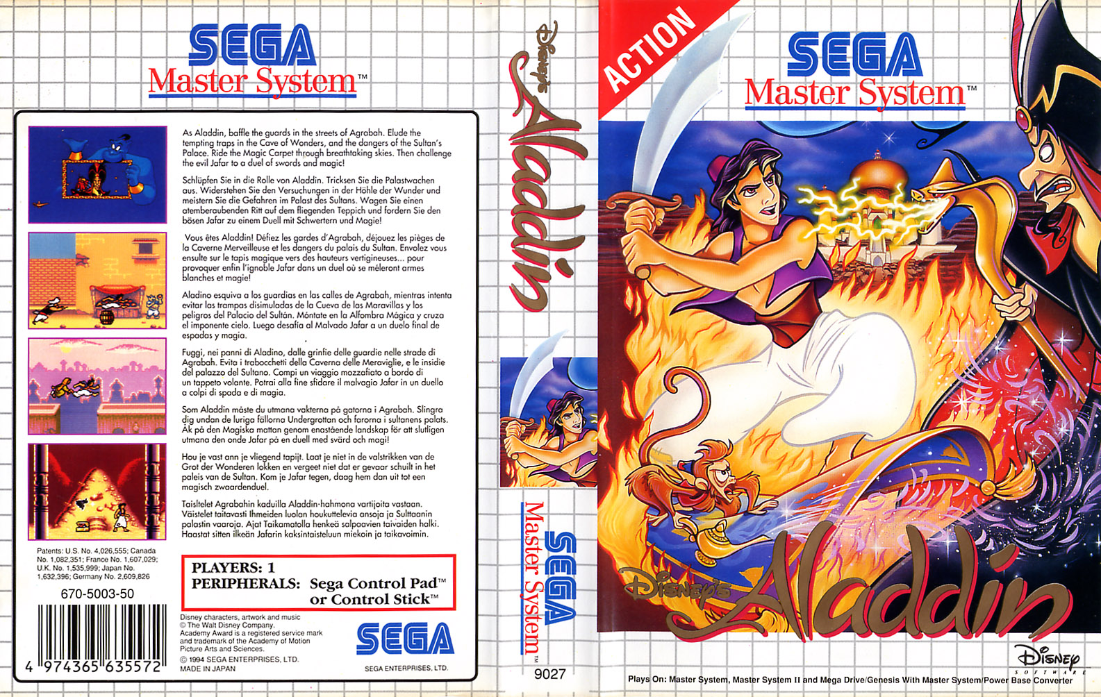 Chuck Rock 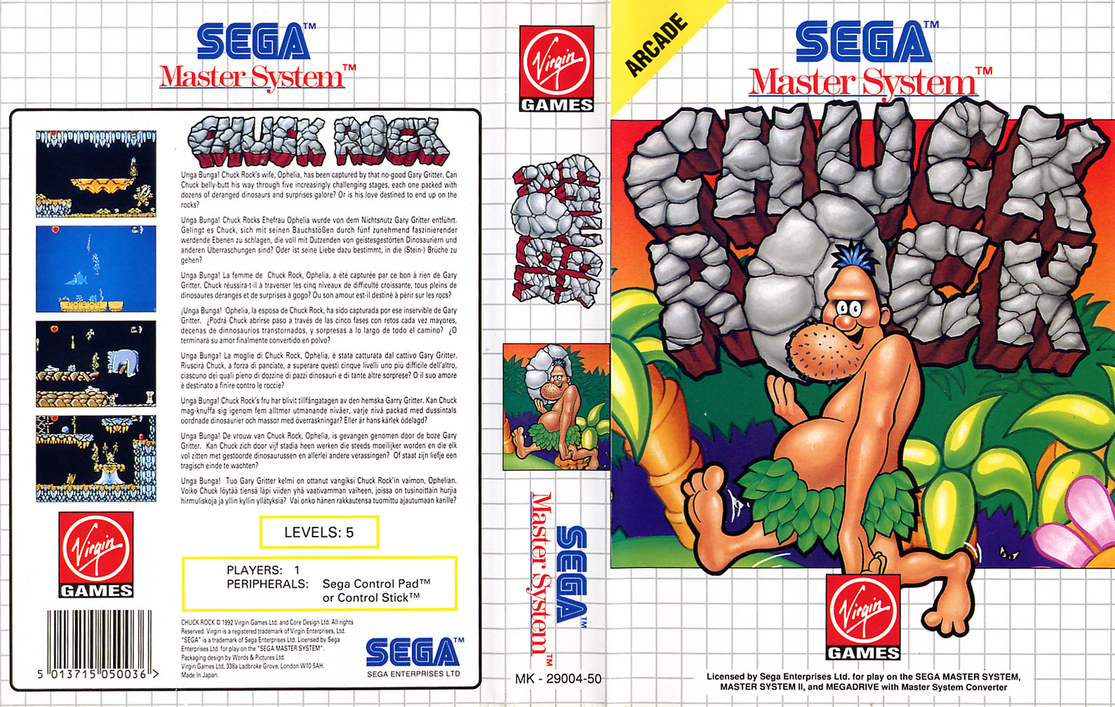 T2: The Arcade Game  Power Strike II  Batman Returns  Kung Fu Kid 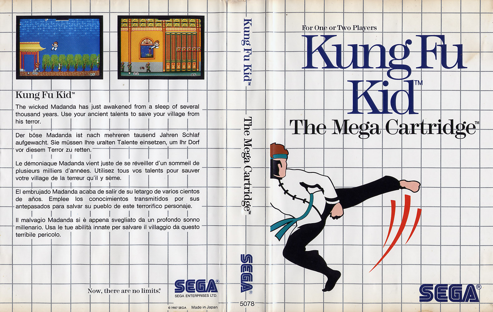 The Simpsons: Bart vs. The World 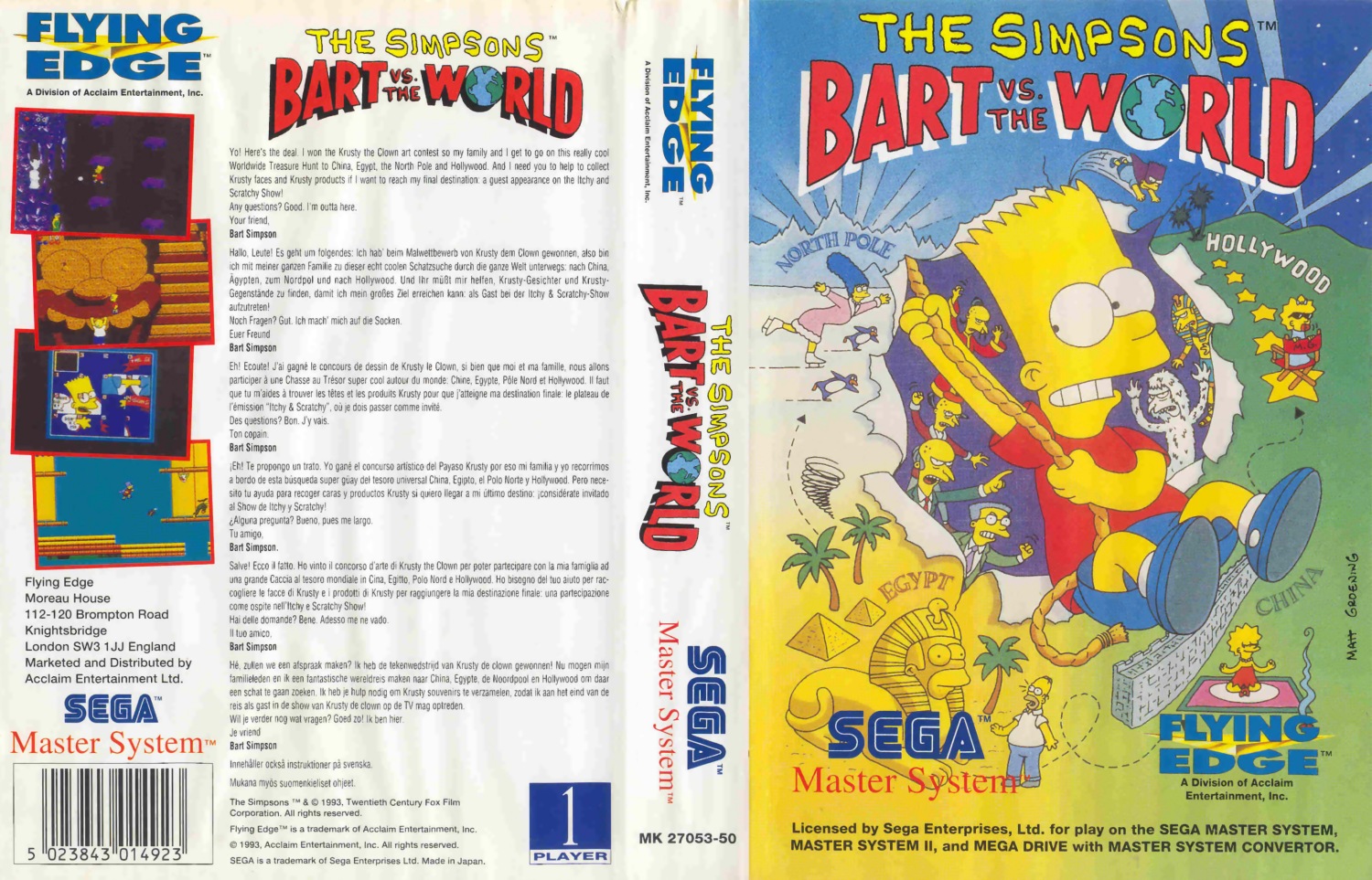 Lord of The Sword 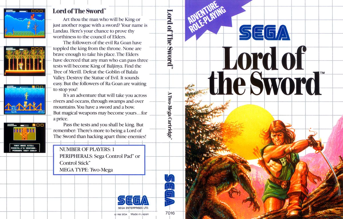 Dick Tracy 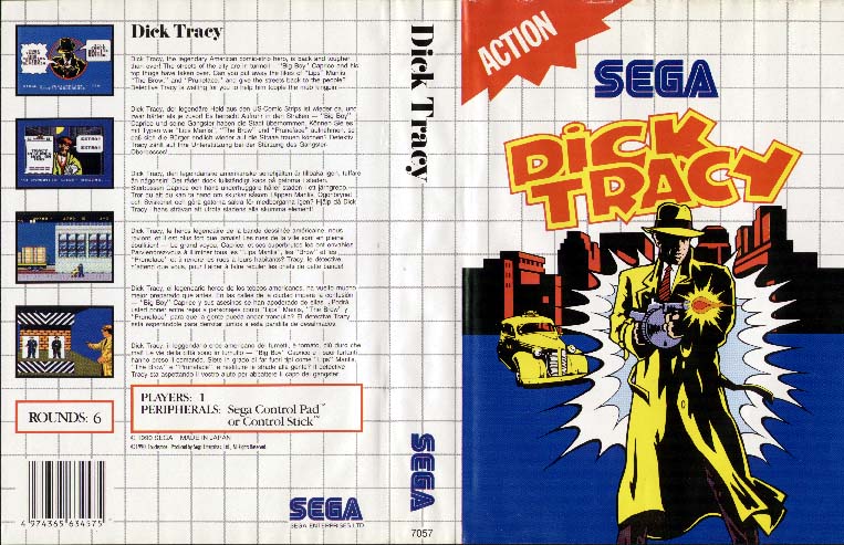 Great Baseball 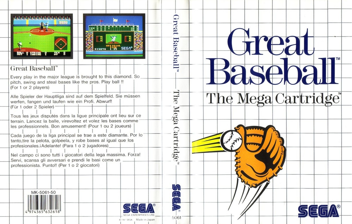 Cool Spot  Ecco the Dolphin  |
|
|
|
Post by wolfticket on Dec 13, 2015 0:53:49 GMT
Double Hawk and Power Strike 2 stand out here, unsure of the third, toss up between Dick Tracy and Ecco.....
|
|
|
|
Post by Stan on Dec 13, 2015 0:55:37 GMT
Double Hawk and Power Strike 2 stand out here, unsure of the third, toss up between Dick Tracy and Ecco..... When I have trouble I've been going with what is UNIQUE to the SMS. Ecco was the same for the Genesis/Megadrive art. Same with Dick Tracy. |
|
|
|
Post by wolfticket on Dec 13, 2015 0:59:21 GMT
Double Hawk and Power Strike 2 stand out here, unsure of the third, toss up between Dick Tracy and Ecco..... When I have trouble I've been going with what is UNIQUE to the SMS. Ecco was the same for the Genesis/Megadrive art. Same with Dick Tracy. You make a good point, that helps settle it lol |
|
|
|
Post by Stan on Dec 13, 2015 1:03:04 GMT
Whoops, I didn't mean to vote for Tracy though, I fixed that one. Also, I've been completely ignoring game content and focusing on art only.
|
|
|
|
Post by flatapex on Dec 13, 2015 17:23:41 GMT
power strike 2 will always win this group for me, the reason I bought it when I did was because it looked cool, never heard of it or anything, figured the nice boxart was worth what i paid lol
|
|
|
|
Post by Centrale on Dec 14, 2015 18:37:24 GMT
My selections for Group F:
Spellcaster - I like the energetic, almost impressionist style. The poses are dynamic, the flaming skull looks suitably angry.
Power Strike II - A great, colorful, action-packed illustration... although arguably only tenuously related to the game it represents, it does evoke an appropriate sense of intense speed.
Lord of the Sword - Possibly the same illustrator as the R-Type cover, it has a similar gritty texture to the paint and shows a great action scene set in a vast alpine landscape.
Honorable mentions: Ecco the Dolphin - another solid effort from Boris Vallejo. Double Hawk - I might like it better if the close-ups of Not-Stallone and Not-Van Damme weren't included... still, a fine painting that would be at home on an SNK cartridge of the era. Bank Panic - almost cubist in its style. Pro Wrestling - often held up as an example by people who don't know any better as "bad" SMS artwork, this charming cartoon would be at home in the pages of The New Yorker. Unfortunately in this tournament format it'll never make it out of the first round, but in a knockout tournament I like its chances to make it through a few rounds.
|
|
|
|
Post by rupert on Dec 16, 2015 20:10:10 GMT
For this group it seems I have picked the current favourites - Double Hawk, Aladdin and Power Strike II. All three are really vibrant and exciting, with lots going on.
There are quite a few nice covers in this group, also Cool Spot and Chuck Rock really bring back fond memories as they were games I had back in the day.
|
|
|
|
Post by Stan on Dec 19, 2015 2:36:40 GMT
My selections for Group F: Spellcaster - I like the energetic, almost impressionist style. The poses are dynamic, the flaming skull looks suitably angry. Power Strike II - A great, colorful, action-packed illustration... although arguably only tenuously related to the game it represents, it does evoke an appropriate sense of intense speed. Lord of the Sword - Possibly the same illustrator as the R-Type cover, it has a similar gritty texture to the paint and shows a great action scene set in a vast alpine landscape. Honorable mentions: Ecco the Dolphin - another solid effort from Boris Vallejo. Double Hawk - I might like it better if the close-ups of Not-Stallone and Not-Van Damme weren't included... still, a fine painting that would be at home on an SNK cartridge of the era. Bank Panic - almost cubist in its style. Pro Wrestling - often held up as an example by people who don't know any better as "bad" SMS artwork, this charming cartoon would be at home in the pages of The New Yorker. Unfortunately in this tournament format it'll never make it out of the first round, but in a knockout tournament I like its chances to make it through a few rounds. This is incredible. |
|
|
|
Post by Stan on Dec 19, 2015 2:37:51 GMT
Aladdin? What the hell have you guys been eating since I've been absent? It's the same art for all the ports practically! I went with originality as my first way to divide up the covers.
|
|
|
|
Post by Rastanfarian on Dec 19, 2015 6:08:02 GMT
Honorable mentions: Double Hawk - I might like it better if the close-ups of Not-Stallone and Not-Van Damme weren't included... still, a fine painting that would be at home on an SNK cartridge of the era. Your comment has me seriously considering changing my vote! But I'll stick with it for now. Looking closer at the Klax cover I realize if you take away the glasses and change the jacket and hat from red to blue, It could be a portrait of me standing there!
|
|
|
|
Post by Kaunisto on Dec 21, 2015 22:37:58 GMT
Spellcaster: just awesome
Dick Tracy: I like when licensed characters are presented in original spirit
Ecco the Dolphin: did you know: the stars in his head are the constellation of Dolphin (like it's really up there in sky)
|
|
|
|
Post by playgeneration on Dec 24, 2015 14:18:53 GMT
Bank Panic - I love some of the early simple artwork, and this is definitely one of the best examples. It tells you basically what kind of game it is but leaves so much to your imagination at the same time. I remember seeing this in the shop and wanting it, having really no clue what it would be like. In some ways its better than elaborate artwork that exaggerates what the game play you ever hope to be like.
Double Hawk - knock off versions of Stallone and Schwarzenegger, love it!
Power Strike II - Brilliant artwork for a brilliant game
|
|
|
|
Post by ShadowAngel on Dec 24, 2015 20:35:22 GMT
Double Hawk - 80's Action! Love it
Power Strike II - More action. It looks exciting
Ecco - It's Boris Valejo, i love his style
|
|


