|
|
Post by wiltshiregamer on Oct 19, 2010 13:37:13 GMT
So I'm going to respray my mkI, but I'm stuck as to what colour scheme to go for. I'm thinking a metallic two tone paint job seeing as the console as standard is black/crimson.
What do you guys think? Do you have any suggestions that you think would look good?
|
|
|
|
Post by gallos_11 on Oct 19, 2010 13:52:38 GMT
|
|
|
|
Post by wiltshiregamer on Oct 19, 2010 15:25:44 GMT
Wow, that looks nice. Was it for sale previously?! Noticed the eBay link at the top of the page. Did it sell?! Any idea how much for?
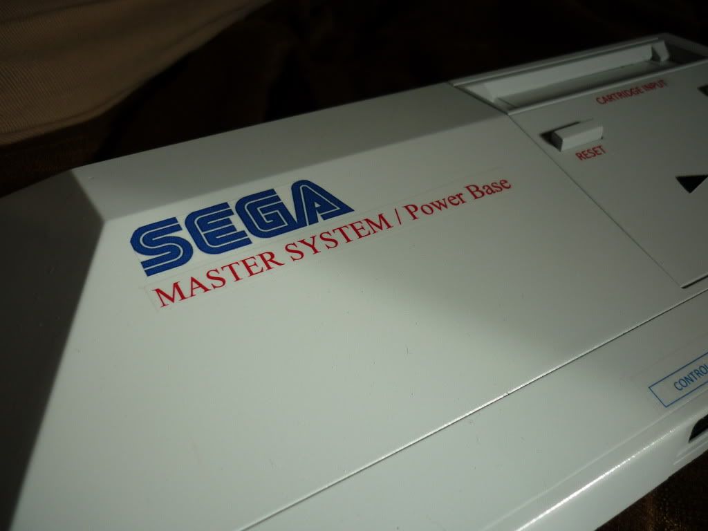
I've spent the day researching how to recreate all the logos on the system and now I think I have it sussed!
Colourwise, I'm thinking of metalic red. I think it would look really nice against the blue/white Sega logo.
|
|
|
|
Post by gallos_11 on Oct 19, 2010 17:08:44 GMT
|
|
|
|
Post by rupert on Oct 19, 2010 19:27:02 GMT
Here are a couple of mods I've done on some SMS to give you ideas. 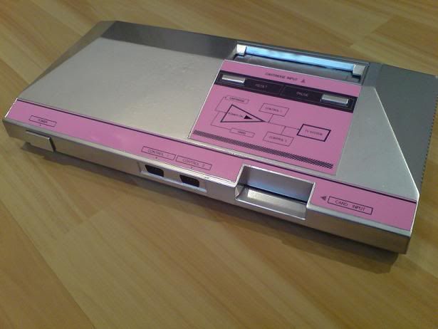 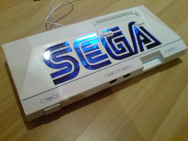 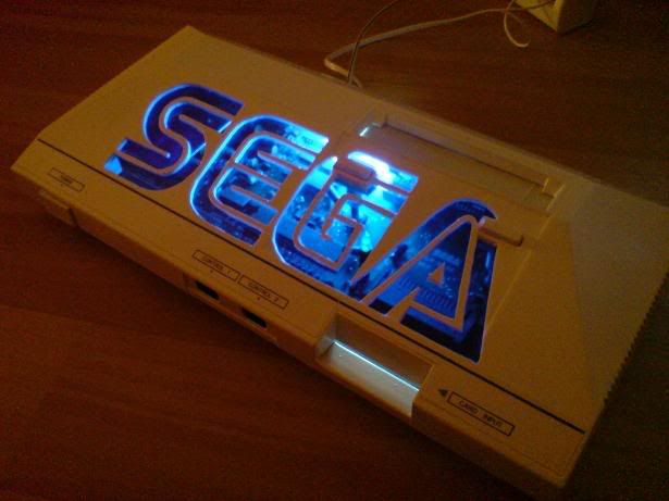 One tip is to peel off and scan the old stickers, modify the colours or style on Photoshop and reprint on high quality paper then laminate. |
|
|
|
Post by ian on Oct 19, 2010 20:12:32 GMT
Here's a couple more that have appeared on eBay over the years. 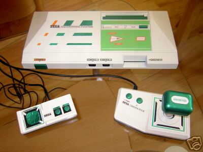 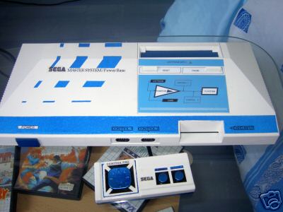 |
|
|
|
Post by wiltshiregamer on Oct 24, 2010 17:04:04 GMT
Rupert, your white mkI looks sweet! How did you get the LED to work in there? I assume you solderit somewhere on the mother board?
|
|
|
|
Post by gallos_11 on Oct 24, 2010 22:07:31 GMT
|
|
|
|
Post by wiltshiregamer on Oct 25, 2010 10:28:04 GMT
I've just sent the seller a question to ask how the details were done! Fingers crossed we'll have a answer soon!
|
|
|
|
Post by wiltshiregamer on Oct 25, 2010 17:36:50 GMT
Just had an answer from the seller, he thinks it's a vinyl wrap on the console.
|
|
|
|
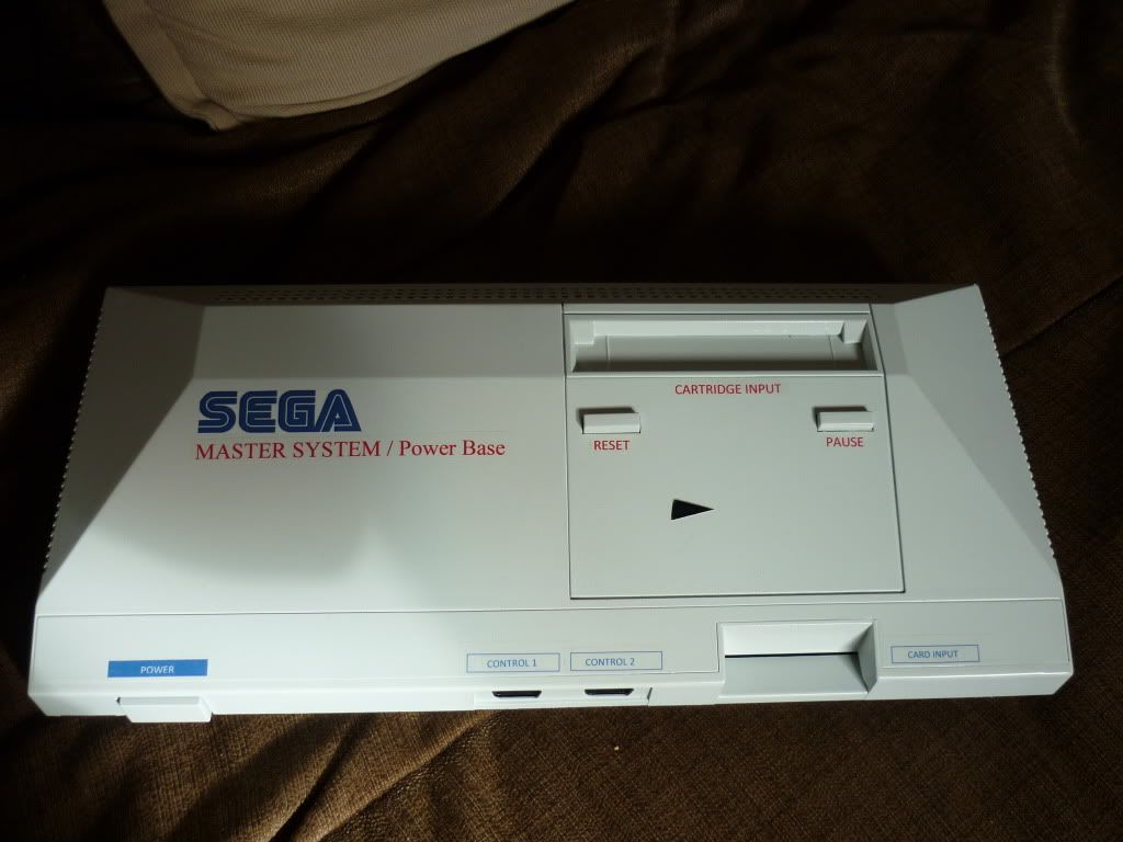
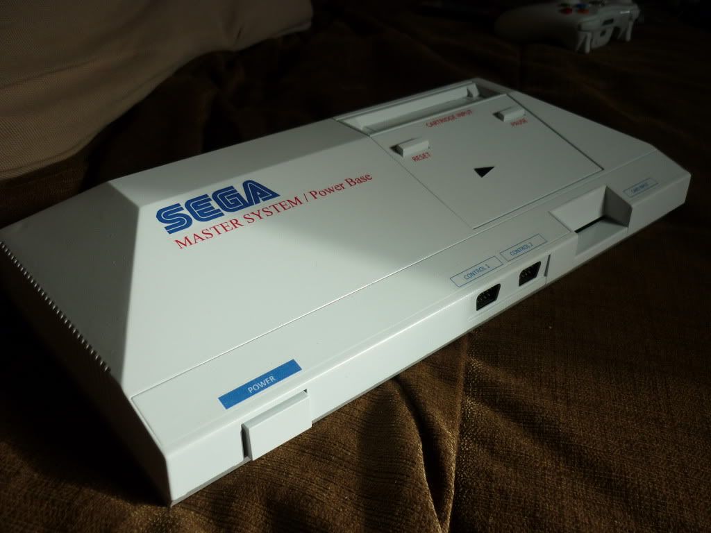
Post by wiltshiregamer on Oct 30, 2010 12:53:20 GMT
|
|
Aypok
Sonic the Hedgehog

Posts: 2,372
|
Post by Aypok on Oct 30, 2010 14:11:40 GMT
Finished my MKI Respray, what do you guys think? I like it; it looks good. It's not perfect, though, so I'll offer a bit of constructive feedback. :) 0) The area under the reset and pause buttons looks a little empty. Furthermore, it looks a little strange with only the off-centre triangle. Perhaps add something around the triangle to make it less bleak. 1) The edges of the stickers/printed-stuff are too noticeable and detract from the look (in my opinion). Not sure what to do about that, though... Despite those two points, it does still look cool. :) I look forward to what else you make. |
|
|
|
Post by wiltshiregamer on Oct 30, 2010 16:07:53 GMT
Yeah, the transfers stick out more than I originally thought they would. I should of trimmed them back a bit more. Something to remember for next time! I agree with your point about the area below the pause and reset buttons. I'll put my thinking cap on for next time! Thanks for the CC Aypok.  |
|
|
|
Post by Tears of Opa-Opa on Oct 30, 2010 16:48:18 GMT
Hey,
I really like it too.
You know what you could maybe put in that area under the reset button would be the gray graph pattern from most game cases.
|
|
|
|
Post by wiltshiregamer on Oct 31, 2010 12:56:26 GMT
Hey, I really like it too. You know what you could maybe put in that area under the reset button would be the gray graph pattern from most game cases. Funny you should mention that, I was thinking of doing that for the whole console! Maybe for the next one... |
|